When it comes to uniforms of the major North American sports, NHL jerseys seem to coax some of the most drastic reactions from fan bases that seem to be more dedicated to logos and colors rather than the actual team.
It’s understandable why though seeing as fans link a franchise’s identity to the sweaters worn.
The NHL, unlike other leagues, seems to have much more turnover in jerseys as the years pass. Teams are constantly changing uniforms or color schemes, though it’s important to note that there have been three or four different brands over the past three decades that have been the main provider of NHL jerseys (KOHO, CCM, Reebok, Adidas).
While there have always been classics like the Detroit Red Wings and Chicago Blackhawks, there has also been a fair share of hideous NHL jerseys, which we will now highlight now by team.
For those with a weak stomach, avert your eyes.
Anaheim Ducks
Could you imagine having one of the most beloved jerseys in all of hockey and then changing it? That’s what the Anaheim Ducks did in their rebranding after Disney sold the team. The famous duck mask will return as a third jersey this year, but their current jerseys are just so disappointing.
Quick mock-up of new Anaheim #Ducks road uniform, the jersey will also have a lace-up collar http://t.co/9c63cYBYmF pic.twitter.com/hRxBY5u1p8
— Chris Creamer (@sportslogosnet) June 27, 2014
Arizona Coyotes
Like the Ducks, the Coyotes are bringing back their original jerseys as an alternate in 2018-19. It’s a smart move considering the jerseys they currently well are just sort of, there. They exist. They’re not ugly, they’re not great. The title of ugliest Coyotes jersey goes to their initial switch to the red and black colorway as they simply pasted a coyote head to a maroon or white jersey.
Today we rewind to Sept. 2003 when Shane Doan was named captain. That’s 12 years strong & counting! ?#FlashbackFriday pic.twitter.com/rJ6F6LmQP1
— Arizona Coyotes (@ArizonaCoyotes) September 11, 2015
Boston Bruins
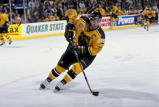
For some reason, the Bruins thought creating an alternate jersey would be a good idea. It wasn’t as they sported these ridiculous gold jerseys for over a decade from 1995-2006.
Buffalo Sabres
The Sabres have everything right except for the color of their uniforms at the moment. The current logo is self-explanatory as a buffalo is jumping over interlocked sabers. Doesn’t get better than that, right? But from 2006-2010, the Sabres sported this ridiculous logo, nicknamed the ‘Buffaslug’. Where’s the rest of the buffalo?
From the ‘slug’ to the days of red and black, three decades of #Sabres uniforms: https://t.co/Rx9bnC23CJ pic.twitter.com/KqkI1BWEVv
— The Buffalo News (@TheBuffaloNews) May 27, 2017
Calgary Flames
There should be absolutely zero black in this jersey whatsoever. As long as they have it, the Flames will have ugly NHL jerseys.
Johnny Gaudreau hit the 50-point plateau Wednesday and joined elite company in the process ~ http://t.co/YiwuvjyJFH pic.twitter.com/DFW9B1z9z4
— Calgary Flames (@NHLFlames) March 12, 2015
Carolina Hurricanes
Anything replacing the Hartford Whalers was going to be put at an immediate disadvantage. But when the Whalers relocated to Carolina and became the Hurricanes, everything was just so disappointing. The logo is underwhelming, the jerseys are underwhelming. Everything is just underwhelming.
Justin Faulk scored his 12th career GWG to move into sole possession of 1st among d-men in @NHLCanes franchise history, passing Joe Corvo. pic.twitter.com/57a95G4GaK
— NHL Public Relations (@PR_NHL) December 23, 2016
Chicago Blackhawks
The Blackhawks have had the nicest NHL jerseys since 1955 and they’ve been smart in not trying to fix something that isn’t broken. So we had to go a while back to find a jersey that at least made us raise an eyebrow. Even these uniforms from 1938 aren’t the terrible compared to some others on this list.
The last time the Blackhawks won the Stanley Cup on home ice(1938), it looked like this. pic.twitter.com/o2ohOQMjl4
— Chuck Garfien (@ChuckGarfien) June 14, 2015
Colorado Avalanche
Teams just shouldn’t try to replicate the New York Rangers’ diagonal nameplate on their uniforms. But the Colorado Avalanche, like others in the past, tried it out with unfortunate results from 2009-2015.
Over the past two seasons, the Colorado @Avalanche are 17-4-2 when wearing their alternate blue uniforms pic.twitter.com/7iXHIGScjg
— Chris Creamer (@sportslogosnet) April 8, 2015
Columbus Blue Jackets
Have the Blue Jackets ever had a nice primary jersey? No. They should wear their alternates that feature the cannon full-time. But their original logo and jerseys upon entering the NHL in 2000 were easily the worst.
Rick Nash: 41st goal of the season, matches career-high set in 2003-04 season (as a 19-year old with Blue Jackets) pic.twitter.com/Ko54pB3U19
— Bucci Mane (@Buccigross) April 3, 2015
Dallas Stars
So the Dallas Star tried to be cute and create a jersey which featured the constellation of what I believe is Taurus. The problem is, it didn’t look like that. Not at all. Even Stars legend Mike Modano ripped the jersey as he nicknamed it the “Mooterus”:
This is close: #Sabres new jersey or….. #Mooterus pic.twitter.com/s1QbBnTrah
— Brian Mazurowski (@BMaz1) September 4, 2013
Detroit Red Wings
I have to go back to when the Detroit Red Wings were not called the Red Wings in order find an ugly jersey because the shirts on the backs of Gordie Howe, Steve Yzerman and Henrik Zetterberg have been absolute dimes. So take a walk back into history with me as we marvel at the uniforms worn by the Detroit Falcons from 1930-1932 before they became the Red Wings:
On this day in 1930, the Detroit Falcons (later became @DetroitRedWings) played their first @NHL game https://t.co/udHUNbfE6a pic.twitter.com/mp1Snkwhax
— Mitchell & Ness (@mitchell_ness) November 13, 2016
Edmonton Oilers
NHL teams have had this problem instituting navy blue to replace royal blue for some reason. Personally, I hate it, which is why I hated when the Oilers moved away from royal blue home jerseys to navy ones. They wore it from 1996-2012.
DOUGIE! Former #Oilers captain & #Isles assistant coach Doug Weight honoured tonight for #FarewellRexallPlace! pic.twitter.com/N9tTPiSzuF
— Edmonton Oilers (@EdmontonOilers) February 29, 2016
Florida Panthers
The Panthers went away from the aggressive cat that was leaping at you in sheer ferocity to go with a logo that looks like it belongs on a soccer uniform. Shame.
Per @EliasSports: Aaron Ekblad (21 years, 23 days) is the youngest defenseman in @FlaPanthers history to score a shorthanded goal. #FLAvsPHI pic.twitter.com/6KrgumXJQI
— NHL Public Relations (@PR_NHL) March 3, 2017
Los Angeles Kings
The jersey worn by Luc Robitaille on the far left of the photo below is everything you need to know about what went wrong with the Kings jerseys. They haven’t had a nice one since 1998 and should probably bring back the purple and gold if we’re speaking frankly.
Blake joins Luc Robitaille, Wayne Gretzky, Dave Taylor, Marcel Dionne & Rogie Vachon as the 6th retired Kings jersey. pic.twitter.com/sjukHsfWAh
— Arash Markazi (@ArashMarkazi) January 14, 2015
Minnesota Wild
The Minnesota Wild have not had nice NHL jerseys since their inception at the beginning of this millennium. Granted, they should still be the North Stars and the franchise currently in Dallas should be something else. Take your pick of Wild jerseys though because you’ll find an ugly one.
“I’m learning lots from him. It’s been great.” – Mathew Dumba http://t.co/UxnHK3meti pic.twitter.com/C0KpqOSJUL
— NHL (@NHL) April 6, 2015
Montreal Canadiens
Like most of the Original 6 teams, the Montreal Canadiens’ uniforms are classics. But back before there was even an NHL, the Canadiens had these horrifying striped jerseys that would probably hurt your eyes if the photo below was colorized. Those stripes are red, white and blue and it is just as bad as you think it is.
#FindCraigFriday, in which @CraigyFerg is using his time travel powers to visit the 1912 Montreal Canadiens. pic.twitter.com/LLjPba5onh
— Craig Ferguson Show (@TheCFergShow) February 12, 2016
Nashville Predators
Now that I think of it, the newer expansion teams around the NHL don’t have nice jerseys. Nashville’s might be one of the better ones, but they decided to go with a mustard-colored third jersey with a droopy-looking sabertooth cat which they used from 2001-2007. Thankfully, the nightmare fuel is gone.
Spotted a mustard Predators jersey from the all too brief Peter Forsberg era: pic.twitter.com/UKMjhVwueE
— Seth Rorabaugh (@SethRorabaugh) November 15, 2013
New Jersey Devils
The Devils have been one of the most consistent franchises when it comes to NHL jerseys. Since 1992, the jerseys have remained largely unchanged from its red, black and white scheme. It’s a nice jersey and a nice logo, but I was always a fan of the red and green uniforms the team wore from 1982-1992.
Taylor Hall has a “personal” point streak of 17 straight games, but NHL only recognizes the 10-game streak since Hall missed some games during that run. Strange. Hall Tied for 6th in points per game. pic.twitter.com/SAuAM8fGPR
— Bucci Mane (@Buccigross) February 18, 2018
New York Islanders
Rejoice, fellow 20-something-year-olds, the fisherman is NOT making this list. Instead, it is the ridiculous black, grey, orange and blue third jersey the team wore from 2011-2014. Someone actually thought this looked like a hockey sweater. Like this team, which has had its fair share of terrible jerseys, needed more embarrassment heaped on its head.
Today marks the final time the #Isles will wear the black alternate jerseys pic.twitter.com/iDjZ3irjBU
— New York Islanders (@NYIslanders) March 23, 2014
New York Rangers
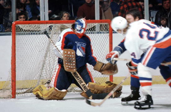
The Rangers are synonymous with the diagonal nameplate going down the front of the jersey. They’ve had it forever…except from 1976-1978 when the team’s logo became the centerpiece of the sweater. It didn’t go over well and the team quickly returned to its traditional roots.
Ottawa Senators
The Senators once had nice jerseys when they were rebooted in the early 90s but in 2000, the team decided to try and add another dimension to the character on their crest. It looked ridiculous, but they wore it for seven years before updating the logo to its current state.
Going old school with the jersey tonight. Lets get it done @Senators pic.twitter.com/8ptsQroVw2
— James Roche (@James_Roche17) April 19, 2015
Philadelphia Flyers
The Flyers are one of three NHL franchises to never change the logo on the front of their shirt. They did decide to come up with this puzzling third jersey in 2002 though and would wear it for five years.
Kinda wish I brought my Flyers’ third jersey with Gagne on the back to school. I do mean this one pic.twitter.com/NTuxpCra5x
— Brendan Breslin (@Brendanbreslin) February 27, 2013
Pittsburgh Penguins
The Penguins always had some sort of vibrant color in their jerseys whether it was the original baby blue or the bright gold. In 2000, though, the team went away from the “RoboPenguin” and introduced their current logo with a black and dull gold colorway that just sort of said “meh.” Luckily they’ve gotten away from that.
KNOW HOW YOU FEEL: Crosby compares McDavid’s rookie experience to his own from 10 years ago. https://t.co/WQFhn99Cv4 pic.twitter.com/wP0GRD6WXB
— TSN Hockey (@TSNHockey) October 20, 2015
St. Louis Blues
These prospective third jerseys were so ugly that the players refused to wear them. So the Blues scrapped this trumpet design and never saw the ice.
WOW! St Louis Blues Legendary 1996 Trumpets Replica Third Jersey XL https://t.co/d39YbblpbI pic.twitter.com/VsjuuuczSy
— St Louis MO (@StLouisRR) December 21, 2015
San Jose Sharks
The Sharks went from a nice, clean original jersey to something a little too busy with grey shoulders and sporadic black stripes. Not a terrible jersey, but they’ve had so much better over the years:
On this day in 2001, the Ducks traded Teemu Selanne to the Sharks in exchange for forward Jeff Friesen, goaltender Steve Shields and futures pic.twitter.com/GA6x9tPHVU
— Mike Commito (@mikecommito) March 5, 2017
Tampa Bay Lightning
Being the 90s kid that I am, I would wear this jersey in a heartbeat. But there are countless hockey purists who just cringe at the sight of this.
VTG Tampa Bay Lightning 1996-99 Starter 3rd Alternate Hockey Jersey $125.0 #TampaBay http://t.co/Vol3Qyf1vZ pic.twitter.com/sSyZIwupCA
— Tweeting The Top (@TweetingTheTop) September 19, 2014
Toronto Maple Leafs
Have you ever seen a blue maple leaf? I haven’t. The franchise initially got things right when it changed names from St. Pats to Maple Leafs in 1927. Original uniforms featured a green leaf. What a concept. Anyway, enjoy this Plain Jane logo the team wore from 1967-2016.
Watching his son Cole, Darcy Tucker is just one of the dads at the #OHLCombine https://t.co/ElMxa7OKH4 @GareJoyceNHL pic.twitter.com/wLpGVBoVBV
— Sportsnet (@Sportsnet) April 1, 2016
Vancouver Canucks
Nope. NOPE. NOOOOOOOOOOOOOOOOO.
As professional aviators and fans of things that fly we wholeheartedly support the campaign to bring back the @Canucks Flying V jerseys. The moustaches as well. pic.twitter.com/3P4xGuZTNU
— Vancouver Airport (@yvrairport) August 14, 2018
Vegas Golden Knights
These guys are brand new, so they don’t have many options. But why isn’t their home jersey black? It would look so much better.
Golden Knights sign William Karlsson to $5.25M, 1-year deal https://t.co/kxCgQGAGfc pic.twitter.com/zqTZ7JX6jy
— Toronto Sun (@TheTorontoSun) August 6, 2018
Washington Capitals
I’m glad the Capitals got back to their original colors after a brief foray into blue, black and gold. I didn’t hate the eagle, but the one’s with the Capitol Building on it were rough.
THIS DATE IN 2006: Rookie Alex Ovechkin (@washcaps) scored his first career hat trick, incl. OT GWG, in 3-2 W vs ANA pic.twitter.com/YAm1VXA03O
— NHL Public Relations (@PR_NHL) January 13, 2016


